Thursday, April 14, 2011

Lois Van Baarle


Loish


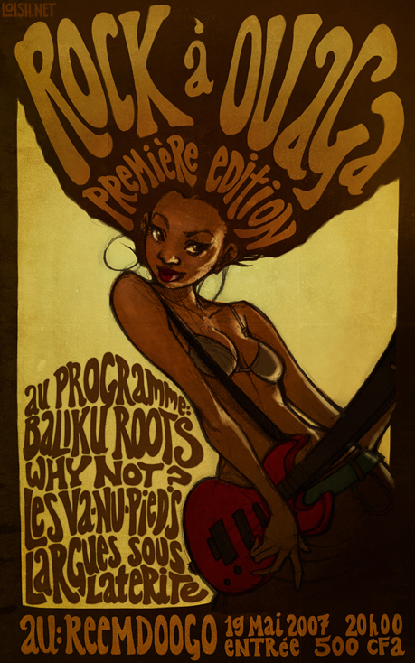
This is my favorite digital artist. I bought her calendar years ago then, when the year ended She is from Holland but has apparently lived in many places around the world. This is unsurprising to me as her artwork seems very cultured... Perhaps all of these different places influenced her work.

Here is one of her galleries: http://loish.deviantart.com/gallery/

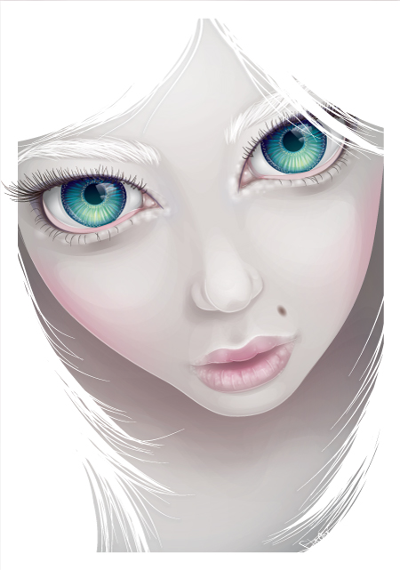
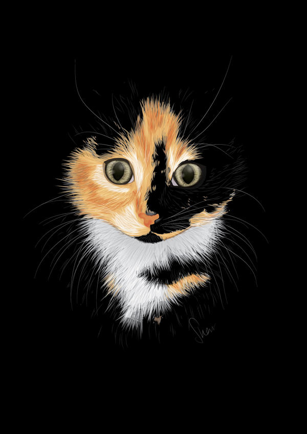
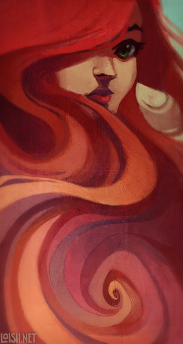
I like her work because it is digital yet appears very rustic, almost traditional. She somehow is able to create different textures in Photoshop to create her raggedy looking works. Her digital work resembles a painting, even the animation looks worn and rusty, the very opposite of what you might imagine digital work to look like (crisp and clean). This creates a very distinct style, where the way she paints look like pastels. She is also an expert in color (in my opinion at least) where she uses a wide range of colors and yet none of them oddly stand out or pop like some pieces, instead they all flow together smoothly. She uses dark colors yet the pictures still remain bright. I have noticed through studying a lot of digital artist's their use of colors define much of their style. I have stated focusing on color theories and the different ways to use colors and her color theory is very distinct, so much that I could pick her work out of a crowd. This is a reminder of how much information colors convey to us; it creates the mood of the entire piece. Even though most of her characters are smiling they all portray different atmosphere's through the colors she picks.

Upon researching her for my blog I realized that she actually went to art school specifically for animation, so I watched her most famous piece: Trichome Blue http://loish.deviantart.com/art/Trichrome-Blue-137674999 This opened up a whole new view of her for me. Nonetheless though, the style of the animation is so obviously Loish...

She explains many of her techniques on her website's FAQ: http://loish.net/faq/ How she chooses colors, the techniques, even how long it takes to make a picture! I definitely would like to try our her style.

Thursday, March 10, 2011

ChewedKandi (Sharon Milne)


ChewedKandi


Sharon Milne is an online vector artist who typically goes under the alias of "ChewedKandi". I found her through DeviantArt as she is currently the Vector Gallery Moderator on DeviantArt. You can see why DeviantArt chose her to moderate this gallery... The details in her work are simply out of this world. The lips on the first picture look extremely realistic when seen up close, including the shading around the eyes and nose... If this woman wasn't purple it would probably be similar to a photograph. In the second image you can almost count the strands of hair in the eyebrows and eyelashes. There are even MORE strands of hair in the third one. It looks as if she has created a path for every single strand of hair... I can only imagine this being equivalent to chinese water torture. Something else I like about her work is that though she vectors from real life she will often distort the image just a little bit (making the eyes bigger, changing the colors, adding different features such as long ears and nails). I like how that kind of little adjustment can really make a killer piece.

Her skill is simply amazing but I find her work a tad boring. It has very little emotional value. She has some works that shine out from the rest but in general I see very little deeper hidden meaning behind her work. It is almost as if it is a gallery of "skill" rather than "feeling". Though I enjoy the technique and the skill level, I prefer pictures with more emotional value.

Nonetheless I follow her religiously on DeviantArt. Why? Because I have been referring to her work as I create my own vector. Since her artwork is so detailed I can get ideas about how to shade and create details in my own vector. Not only that but she has a wide selection of tutorials and resources for vector artists to use so we can see, step by step, how she has created a vector. On top of that but she brings together the vector community and helps point vector artists in the direction they need to go if they want to learn something knew. She is an excellent source to turn to when creating a vector image. I suggest that everyone take a look at some of her tutorials and I will certainly refer back to them in the future.

ChewedKandi Vector Tutorials

Finished?

Wednesday, March 2, 2011

The National Portrait Gallery

Seeing the hide and seek show was quite the experience. I was surprised to see the names of artists I recognized like Susan Sontag, Georgia O'Keefe, Andy Warhol. I even went to see the video which was banned out front of the museum. I found it silly; almost as if whomever proposed the video should be banned was simply looking for a reason to ban something in the gallery. Art shouldn't be banned! FREEDOM OF SPEECH MAN!

But I'm not going to start getting too political.

I wandered around the gallery with my friends and my parents and even went beyond the hide/seek show. Looking at the pictures with my parents and my friends made it a different experience. They each told me how they viewed the picture and it made me look at each image differently.

As for myself the pictures that moved me the most were pictures like this...


Misty and Jimmy Paulette in a Taxi, NYC
By Nan Goldin


Shapes of Fear
by Maynard Dixon


There are two others I'd like to include but I cannot find.

These pictures are extremely simple yet very emotional. "Misty's" and "Jimmy's" stares are almost dead, as if there is nothing left to them anymore... The picture itself is nothing more than a snapshot. I could have quickly taken it with my low quality camera. Despite it's simplicity, it has an entire story behind it.

Shapes of Fear was even more moving to me. I remember the exact moment I walked into the room and laid eyes on this picture. As soon as I looked at it goosebumps crawled up my spine. It was so frightening to me, with just a simple glance. It sucked me in... And for some reason, when I look at it again online it is not as powerful. It's almost boring now. I noticed the same thing with our own digital pictures. On the computer they were nice, but when they were printed out and hung up on the wall they suddenly had so much more prescence to them.

There is certainly a lot more prescence when hung up on a wall.

I think it's because the colors are so simple and it is ovious they are human figures but they are completely covered and in an empty almost colorless plain. They are human figures but they are not human.

What I have learned from these pictures is techniques to put into my art to make more emotion. How to use colors and images to create the meaning I want. A picture with a more powerful meaning because a more powerful picture. A picture with power won't just be looked past, but will sink inside of you and will not be forgotten. Like Shapes of Fear is to me.

Also, if I am to a be digital artist, I'll have to make sure that my pictures get printed out! There is certainly a lot more power to something when it is printed out and seen in it's entirety than when it is on your little computer screen.

Thursday, February 24, 2011

Public Art - Art Event 1

Last Friday I attended the Panel about Public Art. The most important feature of Public Art is that it defines the area it is in. Everything from Professor Sheer's sculptures, to the memorials in Paris, to graffiti on posters, public pieces are all art artistic expressions of their area or they define how one should view the area. The panelists defined public art as having three different functions:

1. Beautification: such as a Professor Sheer's leaf sculpture at the otherwise concrete and cold metro station.
2. Direct Protest: such as Princess Hijab's "Veiling art" in Paris, to poke fun at fashion and a direct protest against the negative stigma toward Islam.
3. Demonstrating new ways to see the world: Paris streets that lead directly to a memorial, establishing French identity. Or Professor Sheer's sculpture out from the the New York Courthouse, a visual representation of the courthouse. And even Princess Hijab's veiled artwork demands the viewer to look at public posters differently.

Professor Sheer also described how an artist should consider three important things when creating a public piece:

1. The Identity of the place: What meaning does the place have? For example a courthouse has a very different meaning than a metro station.
2. The people who interact: Who is going to walk by your art and look at it? How are they going to relate to it?
3. The physical site: Are there trees around it? What does the architecture look like? How can you mold it into the already existing area or make it stand out?

With all this in mind I considered what Professor Friebele described as the NEW public space- the internet. Just like how Graffiti allows an artist to share their work with no price tag internet websites like YouTube, DeviantArt, Facebook, and Blogger allow you to share your work with anyone who happens to be passing by for free. The internet is one giant digital metaphor to a public space; a forum like a public square, game sites like arcades, amazon and ebay like thrift stores and auctions.

I believe the internet is even more flexible with sharing "public art" because a lot of Public Art has to be created with the permission of whomever owns the land otherwise the artwork is illegal. This keeps many artists who cannot receive permission to work in a given space from publicly displaying their artwork. Only those bold enough to break the law are seen. The internet, however, has websites (such as Blogger, DeviantArt, and Youtube) dedicated to everyday people sharing their information to the world or whoever happens to be passing by. Anyone can create a free account on these sites and share their work!

The panel made me look at the internet and art on the internet different. Each function of public art I listed above can be applied to art in the internet as well. This has inspired me to look at my artwork differently. I will especially focus Professor Sheer's specific list of what an artist should consider while making art for some of my internet sites in the future.

"Self Portrait"


Sunday, February 20, 2011

Mike Stimpson

Imagine Andy Warhol's Marilyn Monroe, Alfred Eisenstaedt's "V.J. Day Times Square", or René Magritte's "Son of Man" except with Legos...


>> http://www.wired.com/culture/art/multimedia/2008/08/gallery_legophotog

Mike Stimpson's works are extremely easy. A photographer, he simply sets up the Legos to resemble a famous work then takes a picture of them. Even my friends who have no artistic talent can probably pull this off. Often art critics will say that they appreciate a work that required a lot of hard work and talent. They appreciate something that they themselves could not do making Stimpon's work questionably "art".

I found an article about him from Wired magazine, and well, here are some of the comments:


"All this guy did was buy some toys and then get a magazine desperate for content to publicize it. He didn't "create" anything. At least replace the word "creation" with "approximation" in the story. Wired is getting pretty weak!"

"These really aren't at all good are they.
Still, it's pages like this that prove that even the uninspired and talentless can have their few minutes of fame."

I would instead like to point out that it is not the artistic talent but the idea behind these pieces that truly makes this art. The art itself may be simple but the idea was fun, imaginative, and creative. I would even go as far to say it is original; sure he is copying famous pieces but who would have thought to recreate these pieces with Legos? It is a new way of looking at the famous artworks and even at photography.

Most importantly it is fun and something that people would enjoy looking at. Even those who do not believe this can qualify as art can admit that this is fun. I personally enjoyed browsing through his gallery and seeing famous pieces portrayed with blocky Legos. So I ask, isn't that what art is all about anyway? Looking at a piece and wanting to see more?

I feel this relates to Digital Art because it reminds me of Dadaism where a urinal was placed in a museum and labeled as "art". There wasn't any "talent" behind it in making the piece for it was a readymade, much like these legos, and it raised quite an uproar. I feel as if Dadaism and Stimpson's work teach me to look at the common world differently, to look at art differently. Digital work is going to have to be viewed as a completely different medium than painting and drawing and to make truly creative digital works digital artists have to look beyond conventional art. There is still so much opportunity for creativity with the digital medium.

In closing, I am curious and going to ask anyone who happens to be reading this, do you think this is art?